Tuesday, December 24, 2013

Off with its head (and all other appendages)


I hate postmodern architecture. It’s ucky and gives me a headache.  I particularly hate what sprung up rather abundantly in the 1970’s and 1980’s. I get it. But I hate it. I agree with Venturi and Scott-Brown that modernism had no place to go or grow - that it was increasingly restrictive. I also agree that many modernist architects took themselves too seriously, that they were unbending, and had no sense of humor. But slapping senseless whimsy with questionable palettes onto a building was not the answer. I want to straighten out those squiggles and give color a spine. This does not mean, however, that I reject decoration.  


Much of the architecture that directly preceded modernism was teeming with decoration (Georgian, Greek revival, Italianate, Federal). But there was a soberness - a solemnity to those structures and a respect for the culture they reflected. Even the whirly-gig decorations of Beaux Arts showed sturdy craftsmanship. I admire those resolute buildings. They are still decent and honorable. Similarly, you can say that if postmodernism reflected its culture, it’s the Judd Nelson and Molly Ringwald of architecture.  They were trendy. Now they are dated.


But there is a house around the corner from us that makes me think twice about such a steadfast 
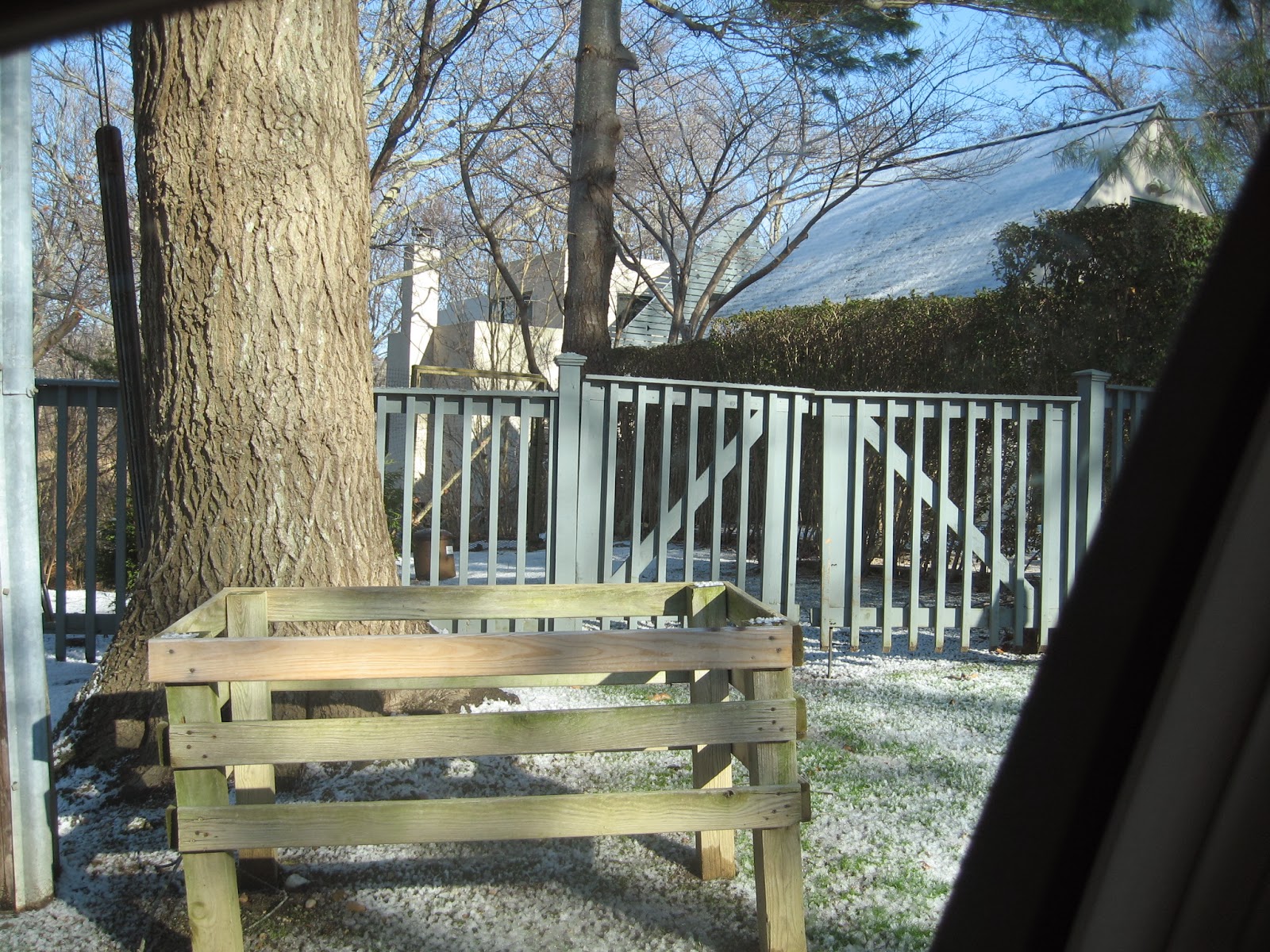
declaration. At first inspection, it is textbook postmodern.  It has a false front to beat all false fronts. It's a little hard to see from the snap and I was nervous about taking too many pictures. Behind the traditional garage at the front of the house is a detached two-foot thick slatted wood curtain that mirrors the shape of the garage and is perpendicularly bolted onto I-beams. The I-beams then join this façade to the house, separating the two structures by a space of about 6-10 feet. Its superfluous-ness is fearless. It’s as though the piece wants to stay at arms length from its superior, like a sulky teenager walking ahead of her parents at the mall. But looking at the house without its accessory, what you see (albeit not remotely the best of it’s kind) is definitely modernism, bordering on brutalism. A big concrete square box with windows.  

I am dying to find out this thinking behind this house. Is it facetious self-awareness?  Is it a joke on postmodernism? Did the architect explain the marriage of the two warring styles to the owners? I do like the idea of the house but in the end, it is still postmodern and still stupid.
 
um what?

Monday, June 11, 2012

The Myth of Main Street

Leyendecker. Courtesy Saturday Evening Post

For my masters thesis I wrote about Main Street USA and the power of its myth. Small towns in America, particularly the Main Streets within them have become common in the shorthand of today's political rhetoric. I showed how Main Street went from being a real place to a myth created by a population's embellished memories and idealized images and how that myth, a powerful symbol of the American way of life,  has been used with much success in the 20th and 21st century political landscape.


However, the image that is conjured up in the American collective consciousness now rarely exists in this country. Most Main Streets have become strip malls, some disused and others completely abandoned. 


Typical stripmall
Riverhead, Long Island

Even the revitalized Main Streets rarely serve their original social function. Residents are not chatting with the local butcher or purchasing flour from their neighbor, the grocer. These streets, that while they retain the built environment of the original Main Streets,  are more likely to be open air shopping malls. 


There are also the newly built Main Streets that mimic the Colonial style of a long gone era. The popularity of these neo-traditional communities signify a desire for a simpler time, one that is rife with the American values of hard work, honesty and goodness. It is easy to forget that these are not real Main Streets.


Kentlands, MD

Perhaps the most disquieting of the real Main Streets are the ones that have been taken down and irreparably damaged by the methamphetamine epidemic. Factories and farms have left these sad town in droves; the residents  have little economic recourse.

For the thesis, I interviewed Rick Prelinger, owner of the Prelinger Archives who thought my topic would make a good documentary. So that's what is on the agenda for me next. Please enjoy the trailer that my wonderful and talented husband cut for it.

http://www.looptvandfilm.com/SVA/MythandMain/Trailer.html

I will let you know as soon as our Kickstarter page is up. Cuz you know you will want to be a part of this ;-)


Friday, June 1, 2012

Brilliant Simplicity

I am sure many readers have seen this already but the logo for the Fashion Law Institute by Pentagram Design is such a wonderful example of delightful thinking. It makes me really happy.


(Art Director: Michael Bierut. Designers: Michael Bierut, Katie Barcelona, John Custer. Client: Fordham University School of Law.)

Thursday, May 24, 2012

Simple Is As Simple Does


Today's designboom daily email highlighted a lamp that caused me some irritation. The lamp was said to focus on simplicity and honesty in design.  


I agree with the observation of honesty. Its construction is transparent. It is straightforward, direct.

Simply said, it did focus on simplicity. It consists of three elements: a clothes pin, a hanging bare bulb and a lamp shade. But I like my simplicity to be a little neater, a little cleaner, a little subtler, a little quieter. By using an object (the clothes pin) for an unintended purpose (as a base for a bulb AND to clip the shade), this lamp is speaking rather loudly and it is saying: "Look at me, aren't I clever? Bet you wouldn't have thought to do this." And so on. It is quite proud of itself. It is anything but simple.

Commenter Charles wrote: " I made the very same lamp 40 years ago as a student because i had no money to buy a proper lamp. Mine used a thin plastic sheet and a heavy spring clamp like you see in a woodworking shop. I also made a light table just as simply and never considered these to be good design, just acts of desperation in poverty."

He continued: "The lamp is in fact not great design."

Commenter J Jones wrote: "What constitutes great design, if not simplicity and novelty in the use of every-day materials? It doesn't depend on "it's been done before;" it depends on its current attractiveness and the appreciation it generates."


Charles is right. Simplicity and honestly in design is obviously a worthy goal but if we are going to praise something and hold it above other things, we need better standards than just those two criteria.

J Jones is wrong. If simplicity and novelty constitutes great design then my use of used chewing gum as a rest for chopsticks during dinner would be a good idea. And oh so clever.


Monday, May 21, 2012

Is Anybody Out There?


I see that my last post was in July of 2011. That was just before my deep descent into thesis land started. After all the flailing, near downing, and gasping for air, I have finally surfaced with my MFA in Design Criticism from the School of Visual Arts firmly clutched in my grubby little fingers. It doesn't mean I get to be snarky about ugly things and gush over cool things. It means I can analyze and evaluate design through a lens that is social, cultural, and historic. It means I can peel back layers and look at the implications of the things we make, from single objects to embedded cultural beliefs. I have learned to look harder. I have a new set of tools to use now. Of course, I will still go after ugly things but with better reason. Hee!