Wednesday, July 27, 2011

Tuesday, July 19, 2011

Living as Form

From e-Flux (DO IT)


Living as Form
September 24–October 16, from 12–8 PM Thursday-Sunday

Historic Essex Street Market, southeast corner of Essex Street and Delancey Street (entrance on Delancey), NYC

Creative Time Summit 3: Living as Form
September 23
NYU Skirball Center, 566 Laguardia Place, NYC

www.creativetime.org/livingasform
www.creativetime/summit

Living as Form
September 24–October 16, 2011

Over 100 Artists and Projects, 25 Curators, and 9 New Commissions Highlighting 20 Years of Socially Engaged Art

Plus, the Third Annual Creative Time Summit to Take Place September 23

This fall, Creative Time will present Living as Form, an unprecedented, international exhibition exploring over twenty years of socially engaged cultural works that blur the forms of art and everyday life, emphasizing participation, dialogue, and community engagement. "Increasingly, we find socially engaged projects that exceed traditional categories of art by utilizing sociality, pedagogy, community outreach, architecture, publishing, and numerous other methodologies to engage the peculiar spectacle-driven thing we know as civic life. Living as Form is an attempt to take the temperature at this particular historic moment to encourage profound forms of social-based action that can alter the course of history," states Nato Thompson who conceived of the exhibition with the advice and assistance of twenty-five curatorial advisors, including Caron Atlas, Negar Azimi, Ron Bechet, Claire Bishop, Brett Bloom, Rashida Bumbray, Carolina Caycedo, Ana Paula Cohen, Common Room, Teddy Cruz, Sofia Hernández Chong Cuy, Gridthiya Gaweewong, Stephen Hobbs and Marcus Neustetter, Hou Hanru, Shannon Jackson, Maria Lind, Chus Martínez, Sina Najafi, Marion von Osten, Ted Purves, Raqs Media Collective, Gregory Sholette, Superflex, Christine Tohme, and Sue Bell Yank. Living as Form will document over 100 artists' projects in a large-scale survey show at the historic Essex Street Market building, commission nine new projects, and provide an online database of nearly 400 projects addressing this complex field of cultural production. Living as Form will be open September 24–October 16, from 12–8 PM Thursday-Sunday.

The show's opening weekend will feature participatory events and tours with artists featured in the show including nine commissioned projects located in dedicated spaces inside the Essex Street Market and the surrounding neighborhood. Featured artists include Bik Van der Pol, Carolina Caycedo, MadeIn Company presented by the Long March Project, Megawords, OurGoods, Surasi Kusolwong, Superflex, Temporary Services, and Time/Bank (Julieta Aranda and Anton Vidokle). Ranging from performances to public interventions and installations, the projects will explore topics including public shrines and ceremonies, mind/body consciousness, the dynamics of power, vertical development and air rights, and alternative economies. For more information and an updated schedule of events, visit creativetime.org/livingasform.

Audiences are invited to engage with some of the artists behind projects in the Living as Form exhibition—as well as critics, writers, and curators—at the third annual Creative Time Summit: Living as Form, on September 23, at NYU Skirball Center. The conference brings together an evolving community concerned with the political implications of socially engaged art to discuss how their work addresses pressing issues affecting our world. Expected presenters include: Alternate ROOTS, Appalshop, Common Room, Cybermohalla Ensemble, Decolonizing Architecture, Jeremy Deller, Darren O'Donnell, Laura Flanders, Theaster Gates, Hou Hanru, Jeanne van Heeswijk, Shannon Jackson, Long March Project, Alan W. Moore, My Barbarian, Neue Slowenische Kunst (NSK)/IRWIN, Ted Purves, Gerald Raunig, Navin Rawanchaikul, Katerina Šedá, Chemi Rosado Seijo, Andreas Siekmann, Mierle Laderman Ukeles, Ultra-red, United Indian Health Services, Urban Bush Women, Dan S. Wang, WochenKlausur, and Women on Waves.

Tickets to the Creative Time Summit are available at web.ovationtix.com. Living as Form is free and open to the public.

ABOUT CREATIVE TIME
Since 1974, Creative Time has presented the most innovative art in the public realm. The New York-based nonprofit has worked with over 2,000 artists to produce more than 335 groundbreaking public art projects that have ignited the public's imagination, explored ideas that shape society, and engaged millions of people around the globe.

SUPPORT
Lead project support for Living as Form and the Creative Time Summit is provided by the Annenberg Foundation, the Lily Auchincloss Foundation, the Nathan Cummings Foundation, the Danish Consulate, the Andrew W. Mellon Foundation, the Mondriaan Foundation, the National Endowment for the Arts, the Panta Rhea Foundation, the Rockefeller Brothers Fund, and the Laurie M. Tisch Illumination Fund.

Monday, July 11, 2011

Not a design related post

UNITED HEALTHCARE/OXFORD DOES NOT COVER MAMMOGRAMS. "The services you received are not covered by Oxford."

I hate insurance companies. They are pure pure evil. So people who cannot afford to pay for expensive procedures will begin to opt out of care. I will be one.

Maybe it is a design related issue. Designed either to make Obama pay for trying to regulate or to kill those without the money to pay for these services.

Thursday, June 30, 2011

My talented friends...

Another amazing book cover from my friend, Katya Mezhibovskaya...

Thursday, June 23, 2011

Curation. And junk like that.


I love the verb to curate. It implies something done carefully, lovingly and with great consideration. Curation is something done by museum experts, shop owners and anyone who decorates his or her home. The act suggests choices of thoughtful inclusion and exclusion.

So I am quite irked when the word curation is used cavalierly. When the writer thinks that by simply using the word, she has implied that care has been taken in the selection of objects. When I see that a grotesque hodge-podge of items offered in a shopping venue has been “curated”, well, I am ready to jump through my computer screen and down the throat of whoever wrote that. (possibly now might be the time when I should switch to de-caf)

Perhaps an example: a day or so ago, the online shopping site, Gilt Groupe, offered “a line of décor in that jetset style”, which had been curated by the “famous designer Matthew Patrick Smythe”.


Now I am not within the economic demographic to know who Mr. Smythe is and I am sure he is a wonderful interior designer (for some people. the room photos shown on the site looked a little too precious and insincere; i.e. books as objects). I wonder about the people who are buying this stuff online. Do they really like these things? Do these things fit in with what is already in the home? Are the items being bought simply because Mr. Smythe put them up for sale? Are you really going to put this on your mantle?


All of these items are random, like someone’s front yard junk sale. Curated? Hardly.


(readers, i am sure you are just as shocked that the high prices are not accompanied by any historic documentation as i am)

Newsprint scented candles. Gee, now that's a good idea.

Think it smells as good as burnt hair?


They really should come out with mimeograph candles. That, I might buy.

Wednesday, June 15, 2011

Never fade away

Now I know why I feel invisible in my own neighborhood...

No Enclave for Old Men*
by James Wolcott
June 6, 2011, 11:14 AM

*Or women

Brendan Bernhard, the Orwell of the East Village (yes, I know Brenda says Auden but maybe we're both right), writes about the chasm between young and old in the theme park of the conscientiously hip.

You notice them everywhere in Manhattan, but perhaps particularly in a slightly out-of-the-way neighborhood such as the East Village — middle-aged or older New Yorkers who look as if they have remained in the city that doesn’t sleep way past the limits of insomnia or common sense.

They seem a little lost in this International House of Cupcakes, among i-Stoned youth, galvanized immigrants, packed bars, and cafes where the music is always played at a volume whose message might as well be posted on a notice board outside — Adults Permitted, But Youth Preferred.

Aging is a delicate, unrewarding business at best, and some people — as a result of genes, outlook, resolution, and money — manage it better than others. To judge by the relative lack of oldsters in the East Village (anyone over 40 is a rarity on the streets after 9 p.m., and most of those are either homeless, comatose, or possibly dead), it’s obvious that this is one of the more trying places in which to grow old. Those who hang on must also confront the irony of living in an era in which they are constantly scolded that it is within their power to remain “young,” while being made to feel ancient almost all the time.

[snip]

Journalists generally don’t write about growing older in a hip young neighborhood because even hinting at an interest in the topic is tantamount to an admission that they may be getting a little long in the tooth themselves. Yet age apartheid is one of the most salient and least discussed aspects of life in the East Village. In his disastrous but unforgettable mayoral campaign of 1969, Norman Mailer suggested turning the East Village into an autonomous zone, leaving the acid-heads and “freaks” to run the place, rather as the Danes did with the Christiania section of Copenhagen a couple of years later. It never happened, but in a way the neighborhood is as unbalanced as if it had.

No such apartheid here on the Upper West Side, where the oldsters terrorize young and middle-aged alike with random complaints that have long, complicated histories attached that we're all supposed to be familiar with. I would provide examples but it's no way to start a Monday.

Monday, June 13, 2011

Simple. And clever.


A friend of ours recently bought an apartment and planned some minor renovations: sand and seal the floor, take out the walls of the second bedroom and add a Murphy bed. A Murphy bed? Yippee!

In space shy Manhattan apartments, it is the perfect solution to the problem of a seldom-used guest bedroom. There are other options. There is the daybed, the fold-out couch, the aerobed, and the “don’t-go-to-bed-drunk” hammock but none of them are all that clever. The Murphy bed really is clever, isn’t it?

And who doesn’t love a Murphy bed? As a kid, I was fascinated by these life-size gadgets. I loved the presto change-o aspect of them. One minute you see a plain wall and the next, viola, a perfectly made bed. It was like the secret door in the bookcase of a mansion’s library or (eek) in the guest bedroom. As kids, we like gadgets. We like things that do stuff, things that change from one thing to another, things in which the ultimate intention isn’t immediately clear.

Of course I don’t remember where I saw my first one; it must have been on television or in the movies. The bed just seemed like a genius idea. It seemed like a great place to hide but onIy if you were two-dimensional.

The bed is a piece of furniture that has remained virtually unchanged since around 8000 BCE. The early beds were made up of straw or any other natural cushion found nearby (fir boughs, palm leaves). Around 3200 BCE, beds in Scotland were raised boxes topped with comfortable fillers. Like the pencil, beds do exactly what they are designed to do. With a few aberrations, the main difference in beds has been in their decorative framing. But the Murphy bed does something different. It doesn’t need to be tarted up to look like a space wasting sexy thing. It is cool and sleek just as it is. And it disappears.


Saturday, June 11, 2011

Little Dieter needs to fly


Keep your eyes peeled for this Dieter Rams sticker project.


Because we do adore him!

Friday, June 10, 2011

Fearless


Life, death, love, fear, and God (along with the application of darkness and light to the artistic portrayals of these words) are the most daunting themes in literature, art, dance and film. Yet, to varying degrees of success, these are the most frequently addressed ideas in the arts. Cliché’s are easy to come by. Masterpieces are not.

While Peter Weir’s feature film, Fearless, is one of my favorite movies, I will not call it a masterpiece. But the director does handle the concepts of love and fear, life and death and a bit of God, masterfully, through his protagonist Max Klein, played by Jeff Bridges. He does this with repeated motions. For example: a character’s movement through a hallway, the opening of a door, the resultant light and the subtly abutting darkness. The corridor, the door, the light and the darkness represent the character’s search for answers to the death he avoided. Weir adroitly sidesteps cliché by housing Max’s actions in an organic progression throughout the narrative.


After surviving a plane crash in which many people died, Max walks away from the wreckage with the sense that he has “passed through death”, he begins to think that death can no longer touch him.


He experiments with tempting fate, first, as he punches the accelerator of his rental car upward toward 90 MPH, sticks his head out the window and drives with his eyes closed; second when he orders a bowl of strawberries at a diner, having been deathly allergic all his life. The third time, he walks across 8 lanes of freeway traffic and reaches the other side without a scratch. He lies on his back and screams up at God, “See? You can’t kill me.” His fourth dare finds him standing at the edge of a tall building in a Christ-like pose; he dances on the precipice with the wind blowing all around him. He is unscathed in each instance.


Max is not a jackass. He is not flaunting his invincibility. He is trying to understand it, which is why he continues to put himself in a position of testing it.


Throughout the film, Max walks through corridors, opens doors and steps into light. The hallway of the motel to which he retreats after the crash, the hallway leading to his dead friend’s apartment where he goes to inform the wife of her husband’s fate, the corridor between file stacks through which he runs, fleeing from the promise of a lie. He opens doors. He stops before entering the bedroom door of the emotionally battered fellow survivor, Carla (played by Rosie Perez). The doorway to the roof, the door to the cockpit, the door from his home to the outside all signify a step into the next world. The doors open into light and light is what beckons him. He is trying to leave the darkness. He claims to have passed through death but rather he is walking toward it, trying to touch it. The light comes in two forms. It shines on his face then it shows him the way. We see the light shining on his face as the plane is going down. It shines through the window. The light shines on his face when he realizes how he can salvage Carla. We see it when he walks toward it on streets blocked by “Danger” signs. We see it as he emerges from the cornfield leading survivors to safety. It shines on his face when he crosses the 8-lane highway. Each scene of hallway, door and light represents not just his search but also his conviction of the existence of the other side.


His home is cast in darkness. It is bleak and oppressive. It is a place where lies live, something Max no longer does. He suffers through a strained dinner with his wife and son in the narrow, darkly lit dining room. The dismal workspace his wife keeps in the kitchen is surrounded by darkness. The view up to his office from the kitchen is also devoid of light.


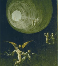
His wife, played by Isabella Rossellini, begins to understand his limbo when she explores his office and finds the images he has been collecting and drawing. At the top of the pile are violent telescoping circles that swirl to a black center. Eventually the sketches of the center are white. The final image she sees on his desk is Hieronymus Bosch’s Ascent into the Empyrean with its accompanying message; “The dying shall go into the light of heaven naked and alone”.


Throughout the film, Weir uses the filmic devices of lightness, darkness and movement through delineated space to explore the difficulties of the examined life and shows that it is not a comfortable journey, though it is an essential one to the survivors in question.


I like movies.

Wednesday, June 8, 2011

House of Eaves


While I don't find this house appealing at all, I do have affection for its cartoon precursor.


(and general affection for all things triplets of belleville)

Tuesday, June 7, 2011

Chigurh, Chigurh


When pitting cherries last week, I was a bit jarred by the violence of the task. I wondered if Cormac McCarthy was inspired by this tool when he dreamed up Anton Chiguhr's brain plugging device in "No Country for Old Men".


(ouch)

Wednesday, June 1, 2011

Awwwwwwwwww....

It's ok, you can call me a sap cuz I cried.


(thanks, again to The Daily What)

By the way the mural is at 2nd St. and Avenue A.

You can also call me lazy cuz I have been simply posting links lately. But really, I am collecting stuff for original content. Really. Honest. (how's my tan?)

Thursday, May 26, 2011

Monday, May 23, 2011

Beauty, briefly.


(thanks to the Roosevelt Islander for the pic)


The consideration of beauty is an elusive task. Sometimes it seems apparent to everyone, sometimes to just one person. Sometimes it hits you over the head. Sometimes it simply emerges like a Polaroid picture. Sometimes beauty is a memory that arises, with its edges soft and burry. Our own Roosevelt Island Tram enables us to experience beauty in two ways. The first as a soft focused view of two shorelines and the second as a memory of other views experienced from similar heights.


The beauty of the Roosevelt Island Tram does not lie in its physical make-up. The beauty arises from the views of Manhattan and Roosevelt Island as seen from 300 feet in the air. The tram facilitates the experience of beauty by allowing us to look at the terrain from such heights. The dirty detailed edges are blurred, a little fuzzy, like a memory.


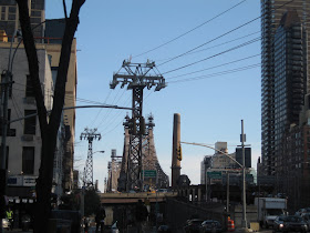
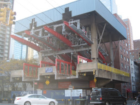
Sneaking up on the Roosevelt Island Tram at 2nd Avenue from 59th street, one immediately notices a mechanical structure that is at odds with its east side Manhattan surroundings. But it is at odds in a good way. The whole contraption looks like an overgrown Tonka Toy, or for those of a younger generation, like an earlier, less sophisticated iteration of a Transformer toy.


Nonetheless, it has a very playful feel with its four bright red support arms, yellow barriers, red pedestrian gates and a giant yellow wheel that appears to run the whole thing (something I doubt it does). The gondola, at rest, is housed under a lovely blue protective roof. The Tram and its supportive mechanical structure is fun but it is not beautiful. If it weren’t for the bone-crushing mechanics of the whole thing, it would be a nice place to play.


The Roosevelt Island Tramway connects Manhattan to Roosevelt Island, travels at about 16mph and takes about 4 minutes to travel the 3100 feet across this portion of the East River. Originally it was to be used as a temporary means of travel while the subway line to the island was under construction. For New Yorkers who spent so much time traveling sub-surface, the tram’s popularity came as no surprise. It remained an option for travel to the island after the subway opened. This year New Yorkers and tourists were deprived of the experience for nine months as it was closed for modernization.


The trip over the East River goes by too quickly. If you squint, you can obliterate the less attractive buildings to the left and right and focus on the majestic aspects of the Queensboro Bridge as well as the Tram’s elegant support towers that seem at the same time fragile and stalwart. From the vantage point of the tram in mid-crossing, it is a view that reveals a breathtaking juxtaposition of the bridge’s substantial yet lacy steelwork set against sky and water.


The river below looks treacherous and hypnotic, a nice counter to the tranquil orderly edges of Roosevelt Island. Looking down from the air, the tidy, slim riverside park appears to be an inviting and peaceful place to sit and gaze at the skyline of Manhattan. On the trip back to Manhattan, it’s best not to look directly at the purely functional shoreline in front of you but distantly to the left where the view is more like a postcard.


The Roosevelt Island Tram invokes beautiful memories. Aerial tram carriages are charged with romantic images: first hand recollections of a ski gondola or second hand memories from movies or photographs. Trams have the thrill and sense of danger of a roller coaster and with hope, none of the sharp turns or deep plunges. At the same time one is struck with the awe-inspiring beauty of the landscape. Panic has the power to stamp beauty more firmly onto your brain.


A memory of a view is not unlike the actual view seen from those distant heights. The focus gets softer, blotting out many of the dingy details, making it more beautiful. The Roosevelt Island Tram takes us away from the sometimes overwhelming drudgery of city life and for a brief few minutes, reminds us that beauty exists.


(thx to rachelb.com for her pic of the Qboro bridge. for some reason i deleted most of my pics from the tram ride. guess i'll have to go back)

Saturday, May 21, 2011

Seeing red


It really is bad form to be covetous. (mostly because someone might see you drooling.) But I do covet this Carlo Colombo 2006 Shanghai couch. I know EXACTLY where it should go.

Must pray to the lottery god.

Oh, and aren't I supposed to be praying for something else today? One must, however, never forget the lesser gods (like the taxi god, or the check in the mail god) because they often feel left out of the bigger picture. As far as gods go, its good to set your sights on medium.

Thursday, May 19, 2011

The Harbor's Ancient Guard


Whenever I see the Verrazano-Narrows Bridge I am so awestruck by its immense power that I nearly stop breathing. The bridge gives me the impression that it’s stuck in time; that it belongs somewhere back in the Jurassic period. Something about its lumbering presence makes me think of the Apatosaurus: the hulking, slow moving, graceful, gentle giant. When the bridge sways, I imagine that it does so with great poise, just as the prehistoric creature might. The bridge is the picture of refinement, strength and incomparable simplicity.


Approaching the bridge never fails to thrill. It has just two towers that ascend nearly 70 stories and a span of 4,260 feet. When coming at it from the Brooklyn side via the Gowanus Expressway, the cityscape on either side of the highway is bleak. Poorly maintained highrises and broken down storefronts do not prepare one for the majesty of the bridge as you approach. That may be what makes the Verrazano seem so grand. It rises out of a place that doesn’t seem noble enough to imagine it. But when leaving humble Staten Island, the quietness of the Verrazano feels like an extension of that borough’s sanguine tranquility.

There are many more vantage points from which to view the bridge. In Bay Ridge, where it lives on the Brooklyn side, one can stare up at it dreamily from the idyllic park just off Shore Road or directly under it from Fort Hamilton Park. From Staten Island, you can walk along the banks of the grassy Forth Worth Park and gaze up at it from there. What gives the bridge part of its silent power is that there are no buildings obstructing the panorama. There is only a vast sky. Viewing the bridge from any of these orientations gives the bridge the respect it deserves. The best way to look at the Verrazano bridge is from a perspective that allows your mind to wander from the past to the present to the future, from imagined pasts to imagined presents and imagined futures. This bridge asks for reverie.

But the Verrazano Bridge didn’t always engender such adoration. According to Gay Talese in his book, The Bridge, for 20 years, the residents in Bay Ridge thought that all the talk about the bridge was just that; talk. They had heard that sort of talk before and expected the same inaction. Stretching back to 1888, there were plans for a railroad tunnel that would connect Brooklyn and Staten Island. But in 1957 the tone of the talk began to change because Robert Moses was becoming more determined. While the residents were under the assumption that the chatter would amount to nothing, engineers were quietly drawing up the plans. And in those plans was the large chunk of Brooklyn that would be sacrificed. The residents saw it as “an enormous sea monster that would soon rise out of the water and destroy eight hundred buildings and force 7,000 Bay Ridge people to move…”


The bridge was built in 5 years, between 1959 and 1964 and for 17 years, was the longest suspension bridge in the world. Because of the height of the towers and the distance between them, the curvature of the earth had to be taken into consideration. It gives the impression of the distance between the front and back legs of the dinosaur. I imagine our bridge getting up and walking around at night, bending its nose down to sniff the shores, nudging the drunks to make sure they don’t fall in the water, and protecting both Brooklyn and Staten Island and ultimately Manhattan from whatever might try to get pass through to the Hudson River from the Atlantic Ocean.

The Verrazano was designed by the engineer, Othmar H. Ammann, whose most significant achievement to date was the George Washington Bridge and who was considered the greatest bridge builder in the world. According to Talese, Ammann and his wife often gently bowed and saluted the George Washington when driving along the Hudson from upstate New York. “That Bridge is his firstborn, and it was a difficult birth,” his wife once explained. “He’ll always love it best.” From Ammann: “It’s as if you have a beautiful daughter and you are the father.”

Even though the Verrazano wasn’t finished until 1964, one has the feeling that it has always been the gatekeeper for the city, that it always acknowledged every passing ship, that it greeted every single person who came to New York by boat for the past 100 plus years. Looking east toward the Atlantic, you feel the thrill of potential travel. One can easily imagine taking the trip to Europe by ocean liner when that was the only available means of travel, slow passage, Adirondack chairs and blankets.

When I moved to New York, I lived in Bay Ridge, Brooklyn. I remember walking over to the park off Shore Road. Sure, I was isolated from New York City where I worked and longed to live, but there was something peaceful in this transition from Ohio girl to New York City girl. The tranquil feeling I got when looking up at that gargantuan bridge curbed any anxiety I might have had about living in New York. New friends always asked how was it going for me, assuming that I had to be going through some major emotional upheaval because I was from the Midwest. I simply didn’t notice a thing. The bridge was solitary, the park was always empty and I was pretty much alone. I liked it that way. Solitude was always precious to me and I saw the bridge as something also very much alone.


The bridge is painted a light blue-gray and there is next to no graffiti, which, even though there is no pedestrian walkway, is very odd. Those who tag structures usually see lack of access as the ultimate challenge. I drove on the upper level over to Staten Island and on the lower level on the way back to Brooklyn. I only is necessary to the language of a city, it made me happy to see that the Verrazano Bridge was unscathed. I would like to think that it is because the structure generates so much awe.

The only downside to crossing the bridge is the $13 toll onto Staten Island. You'd think that for that amount of money they would at least give you a sandwich.

Tuesday, May 17, 2011

The meaning of blue

One of our assignments was to write an essay on a color that has a particular cultural, social or political resonance. I chose blue.


10 years ago, I would have found it difficult to imagine that a color could bring about sheer terror, palpable fear and paralyzing sadness. The color of the most perfect blue sky that ever was, now does this to me. Its beauty was defined by a combination of pleasantly cool temperatures, an unnatural cloudlessness, a lack of color gradation from horizon to horizon, and a quality of blue that held depth. It espoused calm. Azure is the name that most closely describes this hue and it was the color of the sky on the morning of September 11th, 2001. Fortunately I have rarely seen that exact blue again. When I do, it brings me to my knees. My experience of that particular shade of blue and its subsequent meaning has forever changed.

Blue is a color that has as many cultural associations as it does pigment gradients. In the English language “being blue” is associated with sadness


but the notion is so firmly ingrained in our language that we hardly think of color when making the reference. It is considered a calm and restful color. While not proven, it is thought that people are more productive in a blue room because they are more focused. Blue is the color of tranquility as experienced when floating in Caribbean waters. It is associated with liberal causes in the United States. It represents steadfastness, dependability and loyalty as evidenced by the frequent use of blue in American uniforms. Blue is the color of the sapphire in Princess Diana’s (now Kate Middleton’s) engagement ring; it is the color of royalty. Nowadays, blue represents baby boys. Robin’s eggs blue is the color of the Tiffany’s box; so that must mean something good.


Much of the world is blue.

For the most part blue represents happiness and optimism. Those are the feelings one is meant to feel when looking at a clear blue sky.


I was walking my dogs on Great Jones Street when the first plane flew overhead and behind me; as it navigated its way down Broadway toward the towers. There was a terrible sound. When I walked back toward Lafayette Street and saw the gaping hole in the first tower juxtaposed with the perfect sky, the cruelty felt even more pronounced. Walking around downtown that day, dazed, not understanding anything really, I wanted that color to go away. I wanted something appropriate like dark gray thunderclouds. The sky was being disrespectful, it was insensitive and disdainful. It didn’t know what had happened, it didn’t care.


In the same way, that for many years, airplanes looked like bombs to me, this pure color looks like death and it breaks my heart.

(the top swatch of color is a lift from one the pictures of the sky that day)

Back to our regularly scheduled program


For the last 5 months I focused the blog on product design to satisfy the requirements of one of my grad school classes (previous blog content considered too broad). Now that the semester is over, I want to return to a roomier scope of design writing that will be more in keeping with the range of my studies (stuff I really like). So to get myself back into publishing mode again, I will post some of the papers I've written, providing I can find proper visuals. Ya know, cuz we all like pictures.

Saturday, April 30, 2011

Designing Wright


Just in time for Spring! I don't normally approve of anything matchy-matchy but these desk items designed by Adrian and Jeremy Wright appease my fear of clutter.


Thanks KM for sending this.

Wednesday, April 27, 2011

Super CCTV

Whenever people come to visit for the first time, I always try to imagine what it is like to never have seen our apartment before. The exercise always gets me to look at it with fresh eyes, to notice things left undone or thinks about things that need to change.


This CCTV chandelier takes the exercise to a fascinating place: to see objectively just how you are viewed. I don't think I could handle the scrutiny.


The project was done by Hwang Kim, a Korean student of the Royal College of Art.

Monday, April 25, 2011

Shigeru Ban: Yumi lamp


This lovely lamp by Shigeru Ban is an example of proper reinterpretation of a classic.


The design adds to the conversation rather than poorly paraphrasing.