Thursday, May 26, 2011
Wednesday, May 25, 2011
Monday, May 23, 2011
Beauty, briefly.
(thanks to the Roosevelt Islander for the pic)
The consideration of beauty is an elusive task. Sometimes it seems apparent to everyone, sometimes to just one person. Sometimes it hits you over the head. Sometimes it simply emerges like a Polaroid picture. Sometimes beauty is a memory that arises, with its edges soft and burry. Our own Roosevelt Island Tram enables us to experience beauty in two ways. The first as a soft focused view of two shorelines and the second as a memory of other views experienced from similar heights.
The beauty of the Roosevelt Island Tram does not lie in its physical make-up. The beauty arises from the views of Manhattan and Roosevelt Island as seen from 300 feet in the air. The tram facilitates the experience of beauty by allowing us to look at the terrain from such heights. The dirty detailed edges are blurred, a little fuzzy, like a memory.
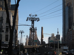
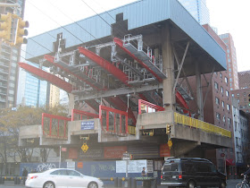
Sneaking up on the Roosevelt Island Tram at 2nd Avenue from 59th street, one immediately notices a mechanical structure that is at odds with its east side Manhattan surroundings. But it is at odds in a good way. The whole contraption looks like an overgrown Tonka Toy, or for those of a younger generation, like an earlier, less sophisticated iteration of a Transformer toy.
Nonetheless, it has a very playful feel with its four bright red support arms, yellow barriers, red pedestrian gates and a giant yellow wheel that appears to run the whole thing (something I doubt it does). The gondola, at rest, is housed under a lovely blue protective roof. The Tram and its supportive mechanical structure is fun but it is not beautiful. If it weren’t for the bone-crushing mechanics of the whole thing, it would be a nice place to play.
The Roosevelt Island Tramway connects Manhattan to Roosevelt Island, travels at about 16mph and takes about 4 minutes to travel the 3100 feet across this portion of the East River. Originally it was to be used as a temporary means of travel while the subway line to the island was under construction. For New Yorkers who spent so much time traveling sub-surface, the tram’s popularity came as no surprise. It remained an option for travel to the island after the subway opened. This year New Yorkers and tourists were deprived of the experience for nine months as it was closed for modernization.
The trip over the East River goes by too quickly. If you squint, you can obliterate the less attractive buildings to the left and right and focus on the majestic aspects of the Queensboro Bridge as well as the Tram’s elegant support towers that seem at the same time fragile and stalwart. From the vantage point of the tram in mid-crossing, it is a view that reveals a breathtaking juxtaposition of the bridge’s substantial yet lacy steelwork set against sky and water.
The river below looks treacherous and hypnotic, a nice counter to the tranquil orderly edges of Roosevelt Island. Looking down from the air, the tidy, slim riverside park appears to be an inviting and peaceful place to sit and gaze at the skyline of Manhattan. On the trip back to Manhattan, it’s best not to look directly at the purely functional shoreline in front of you but distantly to the left where the view is more like a postcard.
The Roosevelt Island Tram invokes beautiful memories. Aerial tram carriages are charged with romantic images: first hand recollections of a ski gondola or second hand memories from movies or photographs. Trams have the thrill and sense of danger of a roller coaster and with hope, none of the sharp turns or deep plunges. At the same time one is struck with the awe-inspiring beauty of the landscape. Panic has the power to stamp beauty more firmly onto your brain.
A memory of a view is not unlike the actual view seen from those distant heights. The focus gets softer, blotting out many of the dingy details, making it more beautiful. The Roosevelt Island Tram takes us away from the sometimes overwhelming drudgery of city life and for a brief few minutes, reminds us that beauty exists.
(thx to rachelb.com for her pic of the Qboro bridge. for some reason i deleted most of my pics from the tram ride. guess i'll have to go back)
Saturday, May 21, 2011
Seeing red
It really is bad form to be covetous. (mostly because someone might see you drooling.) But I do covet this Carlo Colombo 2006 Shanghai couch. I know EXACTLY where it should go.
Must pray to the lottery god.
Oh, and aren't I supposed to be praying for something else today? One must, however, never forget the lesser gods (like the taxi god, or the check in the mail god) because they often feel left out of the bigger picture. As far as gods go, its good to set your sights on medium.
Thursday, May 19, 2011
The Harbor's Ancient Guard
Whenever I see the Verrazano-Narrows Bridge I am so awestruck by its immense power that I nearly stop breathing. The bridge gives me the impression that it’s stuck in time; that it belongs somewhere back in the Jurassic period. Something about its lumbering presence makes me think of the Apatosaurus: the hulking, slow moving, graceful, gentle giant. When the bridge sways, I imagine that it does so with great poise, just as the prehistoric creature might. The bridge is the picture of refinement, strength and incomparable simplicity.
Approaching the bridge never fails to thrill. It has just two towers that ascend nearly 70 stories and a span of 4,260 feet. When coming at it from the Brooklyn side via the Gowanus Expressway, the cityscape on either side of the highway is bleak. Poorly maintained highrises and broken down storefronts do not prepare one for the majesty of the bridge as you approach. That may be what makes the Verrazano seem so grand. It rises out of a place that doesn’t seem noble enough to imagine it. But when leaving humble Staten Island, the quietness of the Verrazano feels like an extension of that borough’s sanguine tranquility.
There are many more vantage points from which to view the bridge. In Bay Ridge, where it lives on the Brooklyn side, one can stare up at it dreamily from the idyllic park just off Shore Road or directly under it from Fort Hamilton Park. From Staten Island, you can walk along the banks of the grassy Forth Worth Park and gaze up at it from there. What gives the bridge part of its silent power is that there are no buildings obstructing the panorama. There is only a vast sky. Viewing the bridge from any of these orientations gives the bridge the respect it deserves. The best way to look at the Verrazano bridge is from a perspective that allows your mind to wander from the past to the present to the future, from imagined pasts to imagined presents and imagined futures. This bridge asks for reverie.
But the Verrazano Bridge didn’t always engender such adoration. According to Gay Talese in his book, The Bridge, for 20 years, the residents in Bay Ridge thought that all the talk about the bridge was just that; talk. They had heard that sort of talk before and expected the same inaction. Stretching back to 1888, there were plans for a railroad tunnel that would connect Brooklyn and Staten Island. But in 1957 the tone of the talk began to change because Robert Moses was becoming more determined. While the residents were under the assumption that the chatter would amount to nothing, engineers were quietly drawing up the plans. And in those plans was the large chunk of Brooklyn that would be sacrificed. The residents saw it as “an enormous sea monster that would soon rise out of the water and destroy eight hundred buildings and force 7,000 Bay Ridge people to move…”
The bridge was built in 5 years, between 1959 and 1964 and for 17 years, was the longest suspension bridge in the world. Because of the height of the towers and the distance between them, the curvature of the earth had to be taken into consideration. It gives the impression of the distance between the front and back legs of the dinosaur. I imagine our bridge getting up and walking around at night, bending its nose down to sniff the shores, nudging the drunks to make sure they don’t fall in the water, and protecting both Brooklyn and Staten Island and ultimately Manhattan from whatever might try to get pass through to the Hudson River from the Atlantic Ocean.
The Verrazano was designed by the engineer, Othmar H. Ammann, whose most significant achievement to date was the George Washington Bridge and who was considered the greatest bridge builder in the world. According to Talese, Ammann and his wife often gently bowed and saluted the George Washington when driving along the Hudson from upstate New York. “That Bridge is his firstborn, and it was a difficult birth,” his wife once explained. “He’ll always love it best.” From Ammann: “It’s as if you have a beautiful daughter and you are the father.”
Even though the Verrazano wasn’t finished until 1964, one has the feeling that it has always been the gatekeeper for the city, that it always acknowledged every passing ship, that it greeted every single person who came to New York by boat for the past 100 plus years. Looking east toward the Atlantic, you feel the thrill of potential travel. One can easily imagine taking the trip to Europe by ocean liner when that was the only available means of travel, slow passage, Adirondack chairs and blankets.
When I moved to New York, I lived in Bay Ridge, Brooklyn. I remember walking over to the park off Shore Road. Sure, I was isolated from New York City where I worked and longed to live, but there was something peaceful in this transition from Ohio girl to New York City girl. The tranquil feeling I got when looking up at that gargantuan bridge curbed any anxiety I might have had about living in New York. New friends always asked how was it going for me, assuming that I had to be going through some major emotional upheaval because I was from the Midwest. I simply didn’t notice a thing. The bridge was solitary, the park was always empty and I was pretty much alone. I liked it that way. Solitude was always precious to me and I saw the bridge as something also very much alone.
The bridge is painted a light blue-gray and there is next to no graffiti, which, even though there is no pedestrian walkway, is very odd. Those who tag structures usually see lack of access as the ultimate challenge. I drove on the upper level over to Staten Island and on the lower level on the way back to Brooklyn. I only is necessary to the language of a city, it made me happy to see that the Verrazano Bridge was unscathed. I would like to think that it is because the structure generates so much awe.
The only downside to crossing the bridge is the $13 toll onto Staten Island. You'd think that for that amount of money they would at least give you a sandwich.
Tuesday, May 17, 2011
The meaning of blue
One of our assignments was to write an essay on a color that has a particular cultural, social or political resonance. I chose blue.
10 years ago, I would have found it difficult to imagine that a color could bring about sheer terror, palpable fear and paralyzing sadness. The color of the most perfect blue sky that ever was, now does this to me. Its beauty was defined by a combination of pleasantly cool temperatures, an unnatural cloudlessness, a lack of color gradation from horizon to horizon, and a quality of blue that held depth. It espoused calm. Azure is the name that most closely describes this hue and it was the color of the sky on the morning of September 11th, 2001. Fortunately I have rarely seen that exact blue again. When I do, it brings me to my knees. My experience of that particular shade of blue and its subsequent meaning has forever changed.
Blue is a color that has as many cultural associations as it does pigment gradients. In the English language “being blue” is associated with sadness
but the notion is so firmly ingrained in our language that we hardly think of color when making the reference. It is considered a calm and restful color. While not proven, it is thought that people are more productive in a blue room because they are more focused. Blue is the color of tranquility as experienced when floating in Caribbean waters. It is associated with liberal causes in the United States. It represents steadfastness, dependability and loyalty as evidenced by the frequent use of blue in American uniforms. Blue is the color of the sapphire in Princess Diana’s (now Kate Middleton’s) engagement ring; it is the color of royalty. Nowadays, blue represents baby boys. Robin’s eggs blue is the color of the Tiffany’s box; so that must mean something good.
Much of the world is blue.
For the most part blue represents happiness and optimism. Those are the feelings one is meant to feel when looking at a clear blue sky.
I was walking my dogs on Great Jones Street when the first plane flew overhead and behind me; as it navigated its way down Broadway toward the towers. There was a terrible sound. When I walked back toward Lafayette Street and saw the gaping hole in the first tower juxtaposed with the perfect sky, the cruelty felt even more pronounced. Walking around downtown that day, dazed, not understanding anything really, I wanted that color to go away. I wanted something appropriate like dark gray thunderclouds. The sky was being disrespectful, it was insensitive and disdainful. It didn’t know what had happened, it didn’t care.
In the same way, that for many years, airplanes looked like bombs to me, this pure color looks like death and it breaks my heart.
(the top swatch of color is a lift from one the pictures of the sky that day)
Back to our regularly scheduled program
For the last 5 months I focused the blog on product design to satisfy the requirements of one of my grad school classes (previous blog content considered too broad). Now that the semester is over, I want to return to a roomier scope of design writing that will be more in keeping with the range of my studies (stuff I really like). So to get myself back into publishing mode again, I will post some of the papers I've written, providing I can find proper visuals. Ya know, cuz we all like pictures.