Saturday, April 30, 2011
Designing Wright
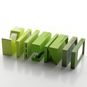
Just in time for Spring! I don't normally approve of anything matchy-matchy but these desk items designed by Adrian and Jeremy Wright appease my fear of clutter.
Thanks KM for sending this.
Wednesday, April 27, 2011
Super CCTV
Whenever people come to visit for the first time, I always try to imagine what it is like to never have seen our apartment before. The exercise always gets me to look at it with fresh eyes, to notice things left undone or thinks about things that need to change.
This CCTV chandelier takes the exercise to a fascinating place: to see objectively just how you are viewed. I don't think I could handle the scrutiny.
The project was done by Hwang Kim, a Korean student of the Royal College of Art.
This CCTV chandelier takes the exercise to a fascinating place: to see objectively just how you are viewed. I don't think I could handle the scrutiny.
The project was done by Hwang Kim, a Korean student of the Royal College of Art.
Monday, April 25, 2011
Shigeru Ban: Yumi lamp
This lovely lamp by Shigeru Ban is an example of proper reinterpretation of a classic.
The design adds to the conversation rather than poorly paraphrasing.
Saturday, April 23, 2011
Personal seating pod
This looks all wonderful and stuff but this claustrophobe is just certain it will go all wrong.
Thanks DesignBoom
Wednesday, April 20, 2011
Boarding Pass
I've been on the fence about luxury brands getting into the skate and surf business.It seems counter intuitive that a culture so anti-establishment would pair up with something so establishment. I can see why Chanel, Celine and Marc Jacobs would want to add street cred to their brands but why would skateboard makers want to sleep with these people? (well they are kinda' sexy.)
But then I understood when my dogwalker AV and her husband, skateboard maker, BP; parents of 2 yr. old twins told me that Marc Jacobs approached them about possibly doing decks for them. Aha. Hope it happens. Go Earthwing!
(yet i do have to wonder if the people who can afford a $300+ skateboard will actually ever use it)
This just in: Earthwing skateboard on the Glee season finale. Soon to be seen in the upcoming Spiderman movie.
Monday, April 18, 2011
By the City/For the City
I know this isn't about product design but I wanted to share a fun idea.
Here's a link to the form By the City/For the city. Get busy y'all
Friday, April 15, 2011
Guess who's not talking about Milan this week...
Just heard a talk by Kerry William Purcell, author of these two fine biographies
The way he approaches his subjects is inspirational for this aspiring writer. He emphasized how the story is told. He spoke of the "individualistic fallacy" and how important it is to focus on all the elements that shape the person. While this seems to make common sense, I am sure many biographers don't weigh those influences quite so heavily.
Also said the sometimes the public persona is the best there is, not what is under the mask.
More good advice: Allow yourself to wander off. I can do that!
Wednesday, April 13, 2011
iPad (un)Inspired
My friend, KM, forwarded a link to this new product with a note to please to blog about it...
It's an iPad (inspired) dry erase board.
Um.
[BIG PAUSE]
She's right. It's really stupid.
From the sellers:
"Nothing beats the power of the whiteboarding. Now you can put down your thoughts in this handy-sized version with an iPad silhouette. Pass it around. Keep it at your desk or at the conference table. Refer to the backside for an interaction guide. 1 to 1 scale with 20 pixel grid. Get the most out of your product design sessions."
All this for just $24.95.
This makes me sad. Designers have better, more worthwhile projects they could be working on. I read this as what some of them are doing in order to pay the rent. "Hey guys, let's think of stuff we can do to jump on the iPad/phone phenomenon."
But I do find these stencils inspiring...
I see some spray paint, brick walls (and maybe jail) in my future.
hee!
Saturday, April 9, 2011
Color Me Neon
There is current color trend in objects and fashion that consists of a hyper-real neon palette. The trend not particularly original but it has significance (hello 1950's and 1980's).
While one may be tempted to say that the vivacious palette’s recent presence is due to the upcoming spring season, which will soon thrust its way out of a brutal winter, I say the explanation is somewhat more complicated. No one predicted this winter’s harshness, so just as easily we could have ended up surrounded with more pastels; a far less cathartic rebirth. I think the plugged-in look has more to do with the relentless economic drubbing and our collective emotional malaise.
Looking through the Design Within Reach spring catalogue, I first found Frank Gehry’s Left Twist Cube poolside seats. The 2004 design was originally made in white but now they are being reproduced in new neon shades. On the same page was another set of poolside seating cubes by Arne Quinz that were also in the same palette.
I decided to check the always up-to-date Bond 09 perfumers for their spring ’11 scent and found it packaged in the same eye-bursting family of green and pink. Louis Vuitton also came out strong with the exuberant colors. While all these items are certainly packaged for the season, color choices must be made; and this year, neon is the prominent decision.
A bolder foray into this palette is the DeLonghi kitchen line previewed at the International Home and House Wares Show in Chicago. Now this is not a seasonal purchase. You are pouring money into some quality items and they are bright! You are expected to have these pieces grace your counters for years to come, therefore the palette could not have been considered lightly. It is quite a commitment to invite a lime green toaster or a mandarin orange espresso maker into your house and expect it stay for years.
Also worth notice are the Modern shapes these items are taking. Combine the comfort of a shape associated with a simpler time (ok, we will allow Mr. Gehry his signature twist) with futuristic neon colors and you have a trend that is making a comment. The Nespresso coffeemakers, while just a handful boast the neon palette, are sporting the streamlined look of a Dreyfuss or Lowey locomotive.
Covetous love for Modern style has not diminished and now we are seeing more of it sheathed in a futuristic panorama. Icon magazine recently featured a story about the Tron Legacy movie set. While the neon palette, true to the original movie, is limited to blue, the living room is furnished with some of Modernisms most iconic pieces: two Mies van der Rohe Barcelona chairs, the Eames lounge chair and the Arco lamp. The past and the future look great together. Now even the counter-top company, Corian, gives us a Tron inspired bedroom and kitchen.
The message seems clear. The colors shake us out of our somnambulant lethargy and the shapes remind us of a bolder, more confident time. We are witnessing the rebirth of trends that are asking us to have energy and hope.
Thursday, April 7, 2011
Milan, who?
Tuesday, April 5, 2011
Monday, April 4, 2011
OOOH pretty, shiny things
Milan design week 2011. Japanese designer Tokujin Yoshioka for Kartell.
So bright I would probably hurt myself. (i think my wine is around here somewhere)
(thanks again designboom)
Sunday, April 3, 2011
Saturday, April 2, 2011
Prego!
Fantastic looking proscuitto knives. Makes me want to learn to carve. Or at least be Italian.
(thanks designboom)